7 Mistakes to Avoid while Developing a Website

In the digital era, a captivating website is just as important to a business’s marketing as its earnings. Our everyday lives are normalized by the internet, which has impacted how people shop. It is no longer an option for a firm to operate without a strong website. Businesses that have subpar websites lose money in addition to losing clients. Unfortunately, a lot of badly designed business websites can be found online.
To have more control over the project, a lot of small business owners use website-building tools to develop their own websites. But because a web designer works on the user experience of a website, which includes things like appearance, layout, and, in their case, content, their lack of understanding of the fundamentals of web design shows in the subpar website they create.
The creation of websites that are hosted on the internet is known as web development. Typically, it’s more in reference to the website’s user experience than its software development. Web development is governed by certain rules. Most of the time, nobody follows them.
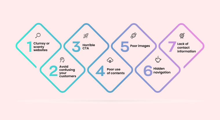
7 Mistakes You Should Avoid While Developing a Website
I assume you have attempted to create your website and are dissatisfied with the outcome. Or perhaps you’ve visited a few websites that so irritated you that you left before reading anything on them. You have to have, like I have. It’s important for business owners to stay away from mistakes in order to keep their clients happy. You want people to return to your website after they view it, and they want you to be online.

1. Clumsy or insufficient websites
You have a tiny window through which to draw clients. You must avoid making your website cloudy if you want visitors to stay on it for much longer than the allotted three seconds. Use the finest website builder available online only to add important details about your company. Information that customers can view immediately. Small firms typically cram as much information as possible into their interface since they have to simultaneously enthrall customers. A packed website is never ideal since it makes it more probable for people to leave than for them to interact with your material.
Don’t, however, make your website too thin. Even if the attention span of the average audience is short, their patience is shorter. Having too many spaces between your information would be bad practice and force readers to scroll endlessly in order to read what you have to say. Don’t give away too much or too little information; instead, give just enough to pique clients’ interest and encourage them to return.
2. Confusing your customers
Finding the right balance between your website’s clumsiness and scantiness without misleading users is challenging. Features that combine disparate typefaces, photos, colour schemes, and website layouts provide a disorienting experience for users. This error usually happens while using amateur website builders. You may assess how confusing your website is utilizing a number of internet tools in addition to website creation software.
Additionally, you can utilize your online website builder’s comprehensive pre-made themes and layouts. The templates of this web software are optimized to keep customers coming back. Your website will become less complicated if you use them.
3. Bad CTA

Your goal in utilizing website-building software is to increase sales and broaden the customer base for your company. The entire process would be useless, and the website would be superfluous if you don’t wind up with any sales. You must employ the appropriate CTA (call to action) in order to generate sales. A call to action requests action from your website’s visitor. Some examples are Read more about this product, click here, obtain a coupon, etc. Companies regret creating their websites since they don’t generate sales.
Unknowingly to them, an ineffective call to action would cause bystanders to stay bystanders, but an effective call to action can turn an indifferent visitor into a devoted client. If you don’t have a suitable call to action, visitors will just visit your website to browse and then disappear.
Make sure your call to action (CTA) is clear and instructs clients on what to do at specific times. Moreover, avoid bombarding visitors with CTAs right away. Let them browse your website for a few minutes before instructing them on what to accomplish.
4. Poor use of content

What you post on your website for users and other websites to access is called content. They are essential and will boost your advertising effort. Contents introduce you and the services your company provides to readers. Thus, to produce original content, employ the AI Content Writer tools. It’s vital to be mindful of the fonts you choose to communicate your ideas.
Make good use of whitespace too. The areas in between design elements are known as whitespaces. Your headlines will stand out, and your text will be easier to read if you use whitespace appropriately. It also aids in drawing the viewer’s attention around your website and softening the impact of your important block parts.
Well-organized templates are provided by online website builders either for free or for a cost. You can utilize the pre-arranged formatting in the templates to make the best use of your information. Most importantly, always update your content. If you don’t update your content, your clients will think that your company has closed.
5. Low-quality visuals

A visual conveys more information than a thousand words. It allows you to convey information to your audience without the need for textual summaries. They are therefore a crucial component of the design of your website. The promise that many business websites hold has been betrayed by the use of images that are irrelevant to the business.
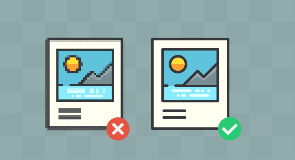
Use only high-resolution photos on your website; low-quality photos will detract visitors. Furthermore, photographs that don’t add anything would bore readers.
Good website creation software will have sections set up for photographs; make use of these. If you include photographs on your pages carelessly, people will become disinterested and unlikely to return.
6. Hidden navigation
If it’s difficult to access your website, it may not last long. People dislike things that cause them problems. If users are having trouble navigating your website, they are unlikely to recommend it to others and are likely to leave negative reviews.
Among businesses, the most prevalent mistake is to make navigation difficult. Make your website easy for visitors to navigate.
Additionally, make it really apparent. In a time when everything is provided for us, it is best to avoid every frustrating navigation. Online website builders are readily available to you. They are designed by experts, and navigational issues have been fixed. Make use of them to steer clear of the error that many companies commit.
7. Lack of contact information
Think about it you went on a trip and purchased a dress. When it comes, your cousin adores it and wants to get one just like it. You looked on the tag for the store’s contact information to make a reservation, but you couldn’t locate it. It’s annoying that your cousin did not receive his dress, and the store suffered a loss of business. You are the store if your contact details aren’t listed on your business website.
The primary cause of this error is business owners’ negligence. Plug-in for website creation tools allow you to connect your emails and social media accounts. In the end, making it easy for clients to get in touch with you regarding orders and questions.
Conclusion
There are a lot of things to think about and even more things to avoid while using a drag-and-drop website builder. It is true that making mistakes when developing your website will hurt your business. When using that website construction program, keep an eye out for the common blunders mentioned above. A reliable and practical internet website builder is The Web Solution USA. Building websites is made easier and faster with the help of web software. You won’t require any specialized coding knowledge to operate basic drag-and-drop editors. With The Web Solution USA’s website builder, you can create cutting-edge websites with easily customizable templates.

